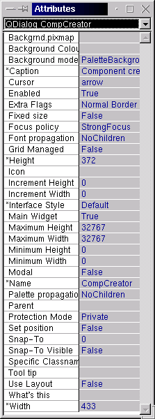
1) Click on windows on the menubar then click attributes.
2) Right click on the component you want to see in the attributes and select attributes.
3) Press alt+a while the component you want to be visible in the attributes has the focus (symbolized by 8 black squares around the component)
 The attribute table is easy to navigate. There is a combo box (drop down
list boxes) on top. This list signifies the current working component,
below that is a dynamic area that changes according to the attribute you have
selected. Below that area is a list of of all available attributes that you can
change, to select one just click on it, and depending on the type of attribute
you will be given a choice on how to change the value. Below is a list of kinds
of attributes.
- List Selection
- This will make the above mentioned area into another combo box in which you can make a selection of a number of choices.
- True/False
- This looks similar to the above, but will always have true or false as the choices in the combo box.
- Text
- This is actually used to text or numeric values, the operator must decide when each value is resonable, this is like this so the user may put a #define into the box that is defined somewhere like the globals editor.
- File
- this is almost identical to the above one, except it is used to enter a file so there is a browse button that becomes available so you can browse your filesystem for the file you want.
- Colour
- This puts a button into the above mentioned area which when clicked will take you to a dialog to allow you to mix the colour you want or select from a series of premade colours. You can then save or cancel from inside that dialog to come back to the attribute table.